Showing posts with label Questionnaire. Show all posts

Thursday, 13 October 2011

A2 Research and Planning: Movie Poster Questionnaire Results

I handed my questionnaire out to a sample of sixteen to twenty year olds. In order to get some honest feedback on my movie magazine, I have completed this study before construction of my cover begins so that I can make necessary changes to suit my target audience.

I used a sample size of twenty people, all between the ages of sixteen and twenty. I separated my sample size into groups of four and put examples of our work on separate tables. The students were given five minutes to fill out an individual questionnaire on my magazine cover before they moved on to assess my movie poster. This is my first attempt at a movie magazine cover.

What is your gender?


Ten males and ten females answered my questionnaire. This gives me an even distribution of boys and girls, whilst my target audience for my movie is predominantly male, my movie caters for females too. It will give me an even and fair series of results.


Does my poster look professional?


Sixteen respondents thought that my poster looked professional and authentic. My qualitative results show that they thought the greyscale suited the genre, the font was suitable, the image looked professional and the credits at the bottom looked authentic.


Would you feel more or less inclined to see the movie that this poster featured?


Thirteen of the respondents felt that they would feel more inclined to watch the movie after seeing the poster. Reasons they gave for this were that it was mysterious with the image of the woods with no human activity and wanted to know what it was about. Reasons for those who replied that they wouldn’t want to see the movie said that the poster was too dull to drab their attention. However, the majority believed that the poster promoted the movie well and suited the genre.


Which features do you like about my movie poster?


This question was multi optional which is why I have thirty six answers. Winning the majority vote is the image, reasons for this being that it was simple yet worked really well and the angle and greyscale effect looked mysterious. Second was font, reasons being that it looked menacing and sited the genre. The layout was praised for its simplicity and authentic looking credits. The colour scheme appealed to the respondents as although it greyscale, it works with the poster.


Which features do you dislike about my poster?


This question was also multi optional and received thirty responses. The most unpopular feature of the poster is the colour scheme, some thinking that it is too dark and dull. This is followed by the layout, arguing that the layout is too simple and it doesn’t grab their attention.

I will make the necessary alterations to my product to suit the answers to this questionnaire.

Friday, 29 October 2010

AS Research and Planning: Questionnaire Music Magazine Results.

Here are the results of the questionnaire I designed in correspondance to my music magazine. I asked twelve girls and eight boys, as I have already sustained my magazine will target females:

The results of this question sustains that consumers are willing to spend £3-4 on a good quality music magazine. I therefore need to ensure great quality when making my magazine.


These results infer that the majority of the consumers asked said they prefered simple and understated magazine covers. I need to ensure that my front cover isn't too vibrant.


These results sustain that consumers wich to have an equal amount of images and text on the content page.


We can infer that the majority of consumers asked are frequent purchasers of music magazines.


The most popular colour scheme is pink, yellow and orange. This is feminine and female orientated- my target audience.


The majority of those asked prefer to see women on their front cover, but men are a popular choice too. The main image should be of a women but inside should contain photos of men.


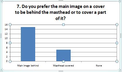
The most popular layout convention is having the masthead behind the image. I aim to do this for my music magazine.


From these results we can infer that consumers prefer to see image beside interviews to help illustrate. I aim to do this in my double page spread interview.

With relevance to the first question, consumers prefer the magazine to be simple and understated.

From these results I can infer that the majority of those asked wanted a glossy magazine cover. I aim for my front cover to be glossy.

AS Research and Planning: Questionnaire for Music Magazine.

Before I begin the mock up on my music magazine I have designed and created a questionnaire to use on the public. The purpose of this is to gather data of what the audience, my readers, want to see in my magazine. Here are the questions I have set:

1. What price would you pay for a good quality music magazine?
a) <£1 b) £1-£2
c) £2-£3 d) £3-£4
e) £4+

2. Do you prefer bright, vibrant colours or simple, understated magazine covers?
a) Bright and vibrant b) Simple and understated
c) Both d) Neither

3. Do you prefer covers to be predominantly images or text?
a) Images b) Text
c) The same amount d) None

4. How often do you buy music magazines?
a) A lot b) Often
c) Rarely c) Never

5. What colour combinations do you prefer out of these examples:
a) Pink, yellow, orange b) Black, red, white
c) Red, blue, green d) Green, blue, black
e) None of these e) I don't mind

6. Do you prefer men or women as the main image on a front cover?
a) Men b) Women
c) None d) Both

7. Do you prefer the main image on a cover to be behind the masthead or to cover a part of it?
a) Main image behind b) Masthead covered.
c) None

8. When reading an interview, should there by many images beside the text?
a) Yes b) No
c) Don't mind

9. Do you prefer contents pages to be understated and easier to read?
a) Yes b)No
c) Don't mind

10) Do you prefer glossy front cover or plain paper covers?
a) Glossy b) Plain
c) Don't mind c) Neither