Showing posts with label AS. Show all posts

Tuesday, 22 November 2011

AS Construction: Contents Page Final


This is my final attempt at a contents page created on Adobe Photoshop CS5. I have taken inspiration and worked on conventions similar to the content pages in magazines such as Look and NME.

AS Construction: Music Magazine Front Cover Final


AS Construction: Double Page Spread Final


I created my double page on Adobe Photoshop CS5. I have used similar conventions found in Q and NME magazines.

I have stuck to a colour scheme of black, white and red; this is continuity through my magazine. I have only used red to highlight the name of the subject of the interview. I have done this as the red grabs attention through the traffic light theory and so that the double page spread isn’t too dull. However, red is most effective when used in small doses and the effect works with the other simple colours used.
The title contains the signifier ‘conversation’, signifying that the interview is down to earth and personal. This will allow the consumers to feel that they are on a personal level with her. I have used the same fonts from my contents page, Elephant and Perpetua.

I decided to use one image on an entire page as this is a convention for music magazines where an interview is accompanied with a photo shoot. I decreased the vibrance by -35 and the saturation by -13. The effect is that the image is not bright and there’s a vintage look to it. This appeals to the target audience for my magazine and is simple and understated, just what they wanted in a magazine. The quote on a black strip is used so that it stands out.

Monday, 6 December 2010

AS Construction: Front cover Final Analysis

AS Construction: Contents Page Draft


This is my final contents page for my music magazine. I have used a similar layout to the contents page in Look magazine. However, I have developed on it and made significant changes.

I have used a collage of images for the top half of the contents page. I have done this because from the results of my questionnaire I found that people preferred to have an even amount of text and images. The collage consists of four images I took on my digital camera while at a music event. The reason I have used images of artists performing/standing on stage is because the music magazine looks more authentic and relevant as it is images of a music event.

The reason I chose the image on the left hand side, under the other two images is because it is of a pretty female, which girls, who are the niche market, would enjoy reading about as she can be seen as a role model for them. She and the band behind her are all wearing white, which denotes purity and cleanliness. However, her dress is made of latex which symbolizes promiscuity. This contradicts the symbolism of the colour of the dress and creates juxtaposition. The effect of this emphasizes her role as a role model to the consumers, who are likely to be teenage girls who strive to be pure and ‘perfect’ but ‘sexy.’ Her black wavy hair denotes power, authority and mystery, while the waves in her hair symbolises femininity.

On the right hand side I have used an image of a pretty female singing into a microphone stand. The microphone stand signifies music, which is relevant to the genre of the magazine. Her hair is blonde and curly, which symbolizes youth and femininity. This is precisely who I have catered our niche market to be. She is wearing a cream lace dress which has connotations with femininity and fashion. Again, this is what I believe the niche market for the magazine would want to read about. I have used a strap line containing the signifier special!; I have done this as the word signifies exclusiveness and to emphasize this I have highlighted the word in pink which denotes femininity, passion and sensuality. Pink can stimulate energy and increase blood pressure and increase action and confidence- pushing the consumer to read it. I have also used the font Bradley Hand ITC as it doesn’t look too harsh or sophisticated; it resembles handwriting which has connotations with girls’ handwriting. I used the font size 38.

The two images I have used in the bottom left side of the collage I have used to create a slideshow and storyboard effect. I rotated both images slightly to the left. I have also bordered the image with a vibrant pink colour. Vibrant pink denotes high energy similar to red; they are sensual and passionate and appeals to females. It is also part of the colour scheme of my magazine. The left side image is of a rap star with a skull T shirt and khaki coat. The skull T shirt signifies death and decay, his khaki coat signifies war and is a synonymous of the colour brown which has connotations with earth. Therefore it is juxtaposition. He is also wearing a red poppy, which connotes war, death and remembrance. I chose to include him as he depicts a genre of music different to the other images and is a more controversial figure but also appeals to girls. He is also looking straight into the camera, instantly making the consumer feel like they’re on a personal level with the artist. The image on the right side depicts four good looking boys- a key marketing strategy for attracting teenage girls. They are all wearing dark colours- primarily black which denotes mystery. Mystery links directly to a person’s sex appeal; this is what teenage girls enjoy looking at.
For my masthead I have used the font Adobe Caslon Pro- similar to the main font layout of the page of Times New Roman- it is sophisticated yet simple- relating back to the results of my questionnaire that my consumers prefer an understated layout. I have also used a font size of 28. I have highlighted Welcome and Wanted in orange. Orange has connotations with energy and warm, similar to red and yellow. Orange is a stimulant which stimulates emotions- which is why I chose to use it for my colour scheme. I want the colour scheme to bring out an emotional reaction to the consumer, urging them to pick up the magazine and read it.

I have separated my contents in three columns which are situated in the bottom half of the page, below the collage of images. Above two of the segments of text I have used a black box and used a white font over the black. This creates effective contrasting so the text inside the box is easy to read and stands out. I have also used italics, for variety of the main font of Times New Roman. The text as I’ve mentioned before are set in Times New Roman and is written in a font size of 11. I have also created the first column a segment of four features that were featured on the cover- this creates ease for the consumer to find something on the cover they were interested in reading. I have also bolded the numbers so that they are clear.

I have used signifiers such as hot gossip and exclusive, reveals, shock and juicywhich signifies exclusiveness, secrets and up to date information. Gorgeous, swoon and sexy and fierce which signifies attractive people- good looking boys that girls enjoy looking at and pretty girls who they want to be like. It also signifies female empowerment; good for my niche market of girls.

I have used one more image situated in the middle of the second column. The image is of the cover star and is a different image to the one on the front cover. This tells the consumers that it contains a photo shoot which means the images are exclusive. The image is a head shot and depicts the person facing away from the camera, but drawing looking to the side slightly to draw her eyes to the camera symbolises mystery as she is not revealing her entire face to the camera. However, she evokes warmth to the reader by her smile. This urges the reader to read about her. Her hair is a deep, brown- burgundy colour which has connotations with passion to conflicting emotions of warfare and violence. It also denotes power and has the ability to make consumers stop to look at it. It can also raise blood pressure, provoking an emotional reaction. Her eyes are light blue, which denotes calmness, the sky and the sea. The sea is often used to symbolise women; therefore her eyes convey calmness, warmth and femininity.

I have placed an editor’s note’s box in the third column, which I have sectioned off with a box. The font inside here is Adobe Caslon Pro and has font size of 11.

Tuesday, 30 November 2010

AS Construction: Music Magazine Front Cover Attempt 1

This is my first attempt at the front cover of my music magazine (minus the masthead). I plan to edit the colour scheme, blending options and the layout slightly.

AS Construction: Photoshopping Images


The first image is unedited and I have taken it for my music magazine. I plan to use this as it is a head shot and I plan to include at least one in my double page spread.


The second image is the same image after editing it on Photoshop. I have improved the brightness to 39 and the contrast to 30. I have also used the spot healing brush to get rid of the snow in her hair.

Thursday, 25 November 2010

AS Construction: Music Magazine Contents Page 2

This is my content page of my music magazine almost completed. I need to add a few more images and edit the colour scheme slightly. I have almost kept to the initial mock up but have edited things slightly; these changes include three columns of content features, a smaller image corresponding to the double page spread and a smaller font of 11.

Friday, 19 November 2010

AS Research and Planning: Music Magazine Contents Page Mock Up


I have decided to use the top half of my contents page dedicated to a photo exclusive to a feature inside the magazine. The photo collage will attract attention to the main feature of the magazine. The strapline to the left of the images will be tilted slightly and will explain what the feature is and should use signifier's like exclusive and special. It will also be written in the font Bradley Hand ITC as this tones down the sophistication of the other fonts and brings a playful side to the magazine. Below the image is the masthead, welcoming the reader to the magazine. This will be written in Adobe Caslon Pro, providing sophistication yet simplicity.

The actual contents will be written in Times New Roman, this is the main font of the magazine and lends sophistication and simplicity. A photo from the photoshoot of the double page spread will be used to illustrate this feature. The editors note will be writen in Adobe Caslon Pro and the signature will be written in elizajane, a font downloaded from Dafont.com.

Monday, 15 November 2010

AS Research and Planning: Music Magazine Double Page Spread Mock Up


This is my initial mock up of my double page spread in my music magazine. I have used a similiar layout to that of the Rihanna interview I analysed from OK! magazine. For the text of the interview I have used Times New Roman- relevant to the front cover and contents text. It is simple, easy to read but has a sophistication to it. The strplaine is also written in Times New Roman. The quote strapline is up for deliberation fontwise, but for this I have used the font 'elizajane' downloaded from dafont.com. It is girly and sweet, like how I want my magazine to be like. The strapline above the masthead is written in a white font called Adobe Caslon Pro and is situated in a black box. The black helps the white stand out and the font is similiar to Times New Roman, it is simple yet sophisticated. The image will be situaed on the right hand side, taking up half the page. Again, this is disputable but this is just my initial mock up so it is subject to change.

The second page is mostly taken up by an image box, this is to emphasise the fact my magazine managed to get a photoshoot along with an interview with this person. Again, the quote part is written in 'elizajane.' It is a direct continuation of the first page, so the interview it still in Times New Roman. The line at the bottom breaks the interview off by the credits, so the magazine looks organised.

Monday, 8 November 2010

AS Research and Planning: Music Magazine Front Cover Mock Ups

This is my initial mock up of the front cover of my music magazine. For the masthead I have used the font Times New Roman- this is sophisticated and is more interesting than Arial. The content features is written in Adobe Caslon Pro- it is similair to Times New Roman and is sophisticated and feminine. The main content features that is relating to the front cover image is written in Times New Roman- like the masthead- and is tilted to the side slightly. This will be written in larger text than the other content features so that it stands out on the cover.


This is my second attempt at a music magazine front cover. I prefer this to my initial cover as there is a bigger variety of fonts but doesn't look as busy as the other one, due to a content feature strapline not obstructing the image. I have used Times New Roman as the masthead, as this looks sophisticated yet simple to read. I have used the font Bradley Hand ITC for the main content feature (which will be in relation to the image). I have used this and the font here is feminine and 'pretty', attracting the niche market of women. I have bolded it for emphasis on the fact it iwll be the main content feature. I have used Adobe Caslon Pro for the three other content features- this looks both sophisticated, feminine yet simple to read. Overall, this layout isn't too busy which I believe works in it's favour.

Tuesday, 2 November 2010

AS Research and Planning: Q Magazine Cover Semiotic Analysis

Q Magazine is a well known music magazine in the UK. It covers a wide range of genres; including pop, rock, indie, grime and dance. The magazine is versatile and appeals to a wide range of music fans, but their main audience are men from the ages of eighteen to thirty, as the music isn’t biased with the mantra of ‘good looking half naked men’ gracing their pages, as does some other female orientated music magazines like Top of the Pops. Also, studying through the magazine there are mainly photos of men, with a definite lack of femininity; men do not wish to read (and look at) women in Q, as this is a music magazine not a top shelf magazine. The men inside aren’t photo shopped, half naked and don’t have rippling and tanned torsos, which is an element why it is mainly a man’s magazine.

The main image used is of musical icon and legend John Lennon, as the magazine is celebrating his 70th birthday. The image is in black and white, which has many interesting connotations. It denotes John Lennon is dead and that black and white symbolises the passing of time and reflects upon death, the image is taken in 1965 (which is indicated by a piece of text in the corner) which effectively points out the time when he was at the peak of his career. The photograph is a close up to mid shot and he is staring contentedly at the camera, the effect being that the reader feels that he is looking at them and addressing the reader directly. The background is white, which simplifies yet cleverly maximises the effect of the cover as it is not too busy and leaves a good background for the content features, strap line and masthead. The background also amplifies Lennon, as he is black, so there is effective contrasting.

The masthead is situated in the left hand corner and is in a very large font, this is because the magazine name is only one letter, so the scale of the name is enlarged to make up for the lack of a long name. The font is in white, but contrasts with a red background. Psychologically, red is an extremely strong colour. It conjures up a variety of contracting and conflicting emotions and denotes love and passion to violence and warfare. Metaphorically, red both symbolises cupid and the devil. Red is also a stimulant, which studies have shown can have a physical effect of respiration and increased blood pressure. Red also denotes power and authority, like for business people and red carpet events. Q used red as a part of their colour scheme to grab attention via the ‘traffic light’ advertising theory that red stands for ‘stop! And read me.’ Red urges consumers to take action (to buy the magazine) and doesn’t allow the magazine to sink into the background. The white font used contrasts exceptionally well against the red background. The white appears brighter when contrasted against such a vibrant red which makes the masthead clearer and easier to read.

The strap line is also red and is situated just below the masthead. Q has used the same colour contrasting technique here, using a red font against the white of the main image (which also acts as the background of the cover). The text just below the strap line acts to add weight and depth to both the strap line and main image. It is written in a gold font and uses signifiers such as ‘unseen’, ‘last’ and ‘whole’. These words signify exclusiveness (which for such a musical icon, who is long dead, is unusual which urges the reader to read), up to date (as far as possible), and a promise to the reader to tell them everything about the man, which due to his status musically, will interest many music lovers.

There is more text below this, which is written in a smaller and white font, as it overlaps the darkness of the image. This is for effective contrasting and again works for the black and white scheme of the cover and allows the reader to read it more clearly. Below this, are three images of alternate covers readers can purchase. The signifier ‘4’ is exerted, with the effect being that the triangle that the number is written in is pointed toward the images and the text above it.. This adds emphasise and entices the reader to look at the images.

To the right of the cover the focus isn’t on John Lennon, but the content features of the magazine. The headings of these features are red, like the mast head and the strap line. Signifiers like exclusive! Signify that readers will be getting inside gossip and vicarious knowledge, which urges people to purchase the magazine. There is a stamp of red, a red circle with white text inside which tells us that there are thirty seven pages of reviews inside the magazine. The border is gold, with the text at the top enforcing the main focus of the magazine, John Lennon, The font of ‘70th’ has a classical edge to it, adding weight to the significance of the issue being a collector’s edition to musical fans.

Most notably, Q rarely uses black and white images on their covers, with this cover being an exception. This is for reason stated before, emphasising the fact he is dead. The colour scheme of red, black, white and gold is extremely interesting and is relevant to Lennon. As we know, red denotes violence and warfare, and the cover uses a significant amount of red. This has connotations with the way Lennon died; he was murdered by a fan with a gun. Also, the gold border and the text below the strap line which is written in gold is relevant to Lennon. Psychologically, gold is the colour of riches and extravagance. The darker tone of gold the magazine uses lends richness, warmth and compassion. We can make connotations toward Lennon here, as he is such a famous figure, who had a lot of wealth. The expression he is pulling suggests contentedness and peace. He looks neither happy nor sad, which can symbolise that in death he is at peace with the world. The image is a verisimilitude image, as the image, with the connotations toward death and time, is true to life.

Friday, 29 October 2010

AS Research and Planning: Q Magazine Contents Page Analysis

I have chosen to analyse the contents page of monthly music magazine Q, issue number 292. This magazine attracts a niche market of predominantly males between the ages of eighteen to forty. It can also appeal to women, but not in the same magnitude as men.

The first page of the contents contains a fairly simple layout. It has a masthead, main image, contents and another small image. The main image is of cover star and magazine dedicated John Lennon. The image, like the cover image, is taken in black and white. This denotes grieving and time passing. It also has further connotations with the age of the photograph. It is a mid-shot to long-shot of him and he is sitting on a rocking chair. This is interesting as we typically associate rocking chairs with elderly people, which in this photo seems ironic as he would be elderly if he was still alive. He has a disturbing look on his face, solemn and mysterious. This adds weight to the black and white theme, the image looks almost spooky. Further juxtaposition includes the connotations associated with the rocking chair and the youth of Lennon when the photo was taken.

The masthead is situated near the top of the page on a red strip. The red psychologically symbolises passion, love, violence and war. The logo Q is written in white, like it is on the front cover. The masthead contains the word Contents. The letters are spaced out, creating a sophisticated effect. The font here is black. Both the white and the black work well against the red to create effective contrasting. It is easy to read and the white and red appear brighter against each other.

The actual contents appear to be set in an Angsana New style font and are black against the white background. To stay with the theme of this issue's magazine, a small box of text is situated first in the contents list. This box is a deep red colour, again having connotations with passion and violence, with the reiterating the fact the magazine is focusing on John Lennon. The text is white, so it contrasts effectively with the deep red. The o in Lennon and the 0 in 70th are jioned together with a small bendy line and are both in a black font. This is a signifier for a symbol of Lennon's famous round glasses. The magazine has cleverly incorporated semiotics into this small logo for clever relevance’s. The contents are listed downward to the left hand side of the first page. The text here is all written in a black font, apart from a small piece of text below John Lennon's piece on the contents. The effect is adding emphasis onto this part of the content features and also relates well to the colour conventions of the magazine. The content features are also underlined with a red line, adding colour to an otherwise plain page.

The smaller image is situated in the bottom left hand corner of the page and depicts an interview layout with a large bolded number (the content number). This is basically an advertisement on the contents page for something inside the magazine. They decided to use images to show some of the contents, which appeals to those who prefer to look at images rather than read text.

The second page of the content page contains six small images, a masthead and contents. The contents have alternated sides, this time situated on the right hand side of the page. They are of the same colour convention, font and size of the previous page. The masthead is the same as the previous page as well, but this time provides the issue number and is written in a white font. The white looks brighter contrasted against the vibrancy of the red, so it is easy to read and bold.

The six images depict (clockwise from top right hand corner): four different variations of the magazine cover which are available to collect, an image of a man from a band called Foals holding bloody pigs head to his face whilst against a dark background, a photo of a woman playing a guitar representing the review section, an image of an interview with The Ting Tings inside the magazine, a double page spread about a band called Sleigh Bells and finally an image of band Gorillaz standing on a ship.

AS Research and Planning: Questionnaire Music Magazine Results.

Here are the results of the questionnaire I designed in correspondance to my music magazine. I asked twelve girls and eight boys, as I have already sustained my magazine will target females:

The results of this question sustains that consumers are willing to spend £3-4 on a good quality music magazine. I therefore need to ensure great quality when making my magazine.


These results infer that the majority of the consumers asked said they prefered simple and understated magazine covers. I need to ensure that my front cover isn't too vibrant.


These results sustain that consumers wich to have an equal amount of images and text on the content page.


We can infer that the majority of consumers asked are frequent purchasers of music magazines.


The most popular colour scheme is pink, yellow and orange. This is feminine and female orientated- my target audience.


The majority of those asked prefer to see women on their front cover, but men are a popular choice too. The main image should be of a women but inside should contain photos of men.
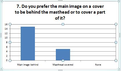

The most popular layout convention is having the masthead behind the image. I aim to do this for my music magazine.


From these results we can infer that consumers prefer to see image beside interviews to help illustrate. I aim to do this in my double page spread interview.

With relevance to the first question, consumers prefer the magazine to be simple and understated.

From these results I can infer that the majority of those asked wanted a glossy magazine cover. I aim for my front cover to be glossy.