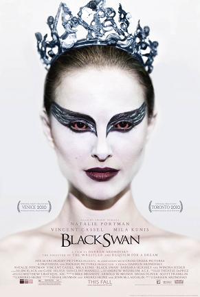
 Black Swan is a 2010 psychological thriller directed by Darren Aronofsky. The plot revolves around a production of Tchaikovsky's Swan Lake ballet by a prestigious New York City company. The production requires a ballerina to play both the innocent White Swan and the sensual Black Swan. One dancer, Nina, is a perfect fit for the White Swan, while Lily has a personality that matches the Black Swan. When the two compete for the parts, Nina finds a dark side to herself. The film is a generic hybrid of a ballet movie, psychological horror and an art film.
The colour scheme used includes white, red and black. White denotes purity, cleanliness and innocence; this is juxtaposition against the black which denotes mystery. The white also denotes the youth of the character. The deep red used in her eyes and lips has connotations with a range of seemingly conflicting emotions from passionate love to violence and evil. It is suggested that her passion for her role in the ballet turns her evil, hence the red in her eyes.
The mise en scene of this poster includes the tiara on the girl’s head. She is blinded by her passion and evil in order to get to the ‘top’- illustrated by the tiara on her head. Tiaras have connotations with femininity, innocence and princesses; however this one is notably spikier and darker than a conventional tiara and it denotes a darker and perhaps evil princess figure.
The angle used in the shot is a close up to mid shot of the girl. The girl is facing and looking into the camera, the effect being that she is staring at the consumer. This is unsettling and further emphasises the genre of the film.
The target audience for this film is varied. Whereas dancers would take an interest in the film the psychological thriller side of the movie attracts older teenagers and people up to their sixties.
The font used in the movie title is fairly simple and is black to contrast against her pale skin. It is small, minimalistic and classical- signifying the nature of ballet. The rest of the text used is a lot smaller and simple. The red used fits with the colour scheme of the poster, so it is not too colourful and the focus is on the girl.